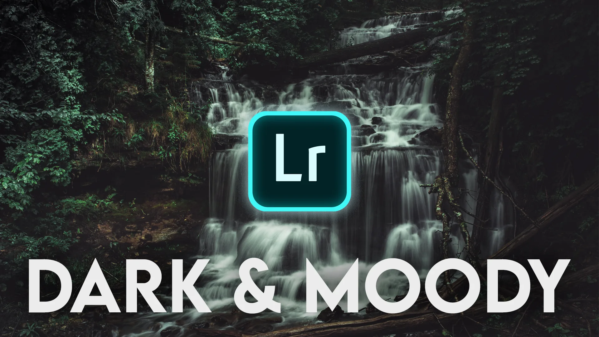
What is Dark & Moody?
Dark, moody tones have been exceedingly popular on apps like Instagram for the past couple of years. Probably because if done right, they look pretty darn good. In this tutorial, I’ll be showing you how to recreate this Dark & Moody look in Lightroom Mobile.
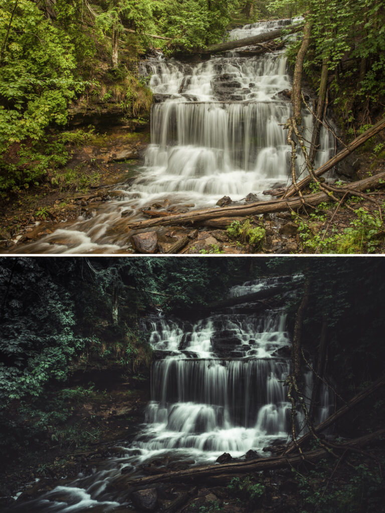
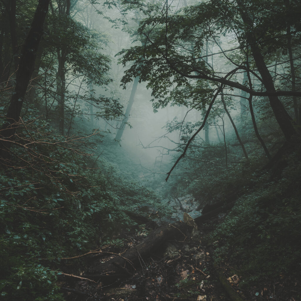
This editing style is characterized by dark, mysterious earthy tones, lifted shadows and muted greens. I’ve found that this preset works best on photos taken on overcast days with plenty of green tones, such as a forest, fields or similar. If done right, it can create a truly ominous, stormy vibe that pulls your audience into your photos.
So, here’s a step-by-step tutorial of how I achieved this look in Adobe Lightroom Mobile. You can also check out my Dark & Moody Lightroom Preset for my exact look.
Dark & Moody, Before/After
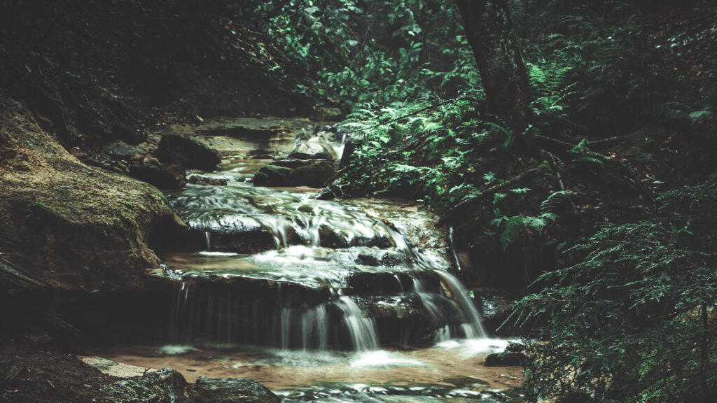
Dark and Moody Tones
I always like to start out every one of my post-processing jobs with a properly cropped, white-balanced and exposed image. I won’t bore you with those details of getting a solid base image to work with, but if you’re new to Lightroom you can check out my RAW Photo Editing for BEGINNERS in Lightroom CC. (The tools carry-over between Mobile, CC and Classes pretty well) So let’s jump right in!
Light Tab
From there, I turned my Exposure down about -.5 and Contrast up +35 to 50. Remember the basic edits will be to taste and to suit your individual image. For this particular image, I set the highlights to -100 and shadows to +100 to maximize detail. This works best with a properly exposed image in-camera. Whites +25ish and Blacks -25. For the Curves, I created a fairly strong S-Curve, lifting the shadow point up about .75 stops.
Color Tab
I cooled the image down a touch, dropping the Temperature -10 and sliding the Tint towards the green -5. I also dropped the Saturation to about -50 (again, to taste). Next I went into the Color Mix tool (AKA HSL in LR CC/Classic). You’ll have to tweak to taste, but here are my basic settings to get you started:
- Red: H+20, S-30, L 0
- Orange: H 0, S-10, L+80
- Yellow: H 0, S-30, L0
- Green: H+50, S-80, L+40
- Cyan: H+40, S-30, L+30
- Blue: H-20, S-30, L+10
- Purple: No Change
- Violet: No Change
Effects Tab
For Effects I turned down the Clarity slightly and turned up Dehaze slightly (as usual, to taste).
I did a VERY light Split Tone to where I added some green to the highlights and purples/blues to the shadows. Another part where you’re going to have to do a little tweaking, no more than +10 Saturation though. Before leaving this Tab, a light vignette usually helps sell this look.
Detail Tab
To finish up, I sharpen all of my images whether in Lightroom or Photoshop. Usually +40 to 50 at a radius of 1 or lower.
Look Wrap-Up: Dark & Moody Lightroom Mobile Tutorial
That’s about it for this “Dark & Moody” Look. I hope I was able to help someone out there. More post-processing guides coming soon! Want more? Watch my Adobe Lightroom Tutorials Playlist on Youtube!
Don’t forget to check out my Newest Lightroom Presets available in my shop! You may just stumble upon a look you can’t live without.
Subscribe below so you don’t miss a single Preset Drop or Giveaway!