In this video, we’re editing some RAW fall colors photographs from this weekend’s trip into the Smokey Mountains. Unedited, these images are quite flat and dull, and I want to edit them more true to life. So, I’ll be showing you how I quickly edit my fall colors photos to make them POP in Adobe Lightroom Classic.
How to Photograph Fall Colors
Before diving into how to edit our fall colors in Lightroom, I’d to quickly talk about how the photos were captured. I was out exploring the Smokey Mountains at sunrise, in North Carolina, with my Nikon Z6. For our first photo (below), my settings were: ISO 100, f/4, 1/320th at 200mm. Also, I’m always shooting in RAW, no exceptions.
Golden hour, about an hour before sunset, or an hour after sunrise, is my favorite time to photograph fall colors. However, you’re in the mountains sunrise and sunset will vary. I recommend exposing for the highlights on the leaves and using a Polarizing Filter to cut the sun glare, if you have one. Lately, I’ve been using K&F Concept, which makes some quality filters. Additionally, you can get 10%-Off all products with my discount code: RunNGunPhoto.
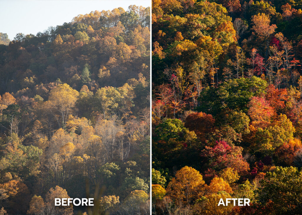
Before & After our Lightroom Edits (Run N Gun Photography)
How to Edit Fall Colors in Lightroom
Now that we have a general idea of how to capture the proper raw image, it’s time to edit in Lightroom. Personally, I always like to start by finalizing my composition, which means making sure my horizon is level and sometime doing a little cropping.
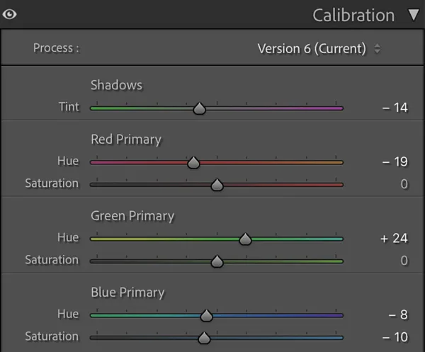
This next step is really where the magic happens: the Calibration Tab. While you can see my exact settings below, I recommend experimenting and finding the perfect setting for your photograph. Remember, you won’t see a massive change right away, but there will be a world of difference after applying basic tone edits to your photos.
My Lightroom Calibration Settings for Fall Colors (Run N Gun Photography)
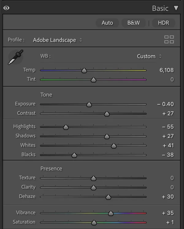
Basic Toning in Lightroom
After getting our Calibration where we like it, it’s time to do the core edit of our fall colors photograph. I start by setting my Profile to Adobe Landscape. This really makes our colors pop, and shows off the work we did in the previous calibration step.
Fall Colors Pro Tip: Don’t add yellows to your fall colors edits by just dragging the White Balance temperature slider towards the warm end. This will give you a muddy, artificial-feeling, global edit. I actually cool my images down a touch for added color contrast.
As you can see from my settings, the rest will depend on your photograph. You can always try hitting the ‘Auto‘ button as a starting point and tweak to taste. And remember no to over-edit — subtlety is key! Moreover, when in doubt, tone your editing down a bit. I wrap up my edits by adding a hint of Vibrance (NOT Saturation) and some Sharpening.
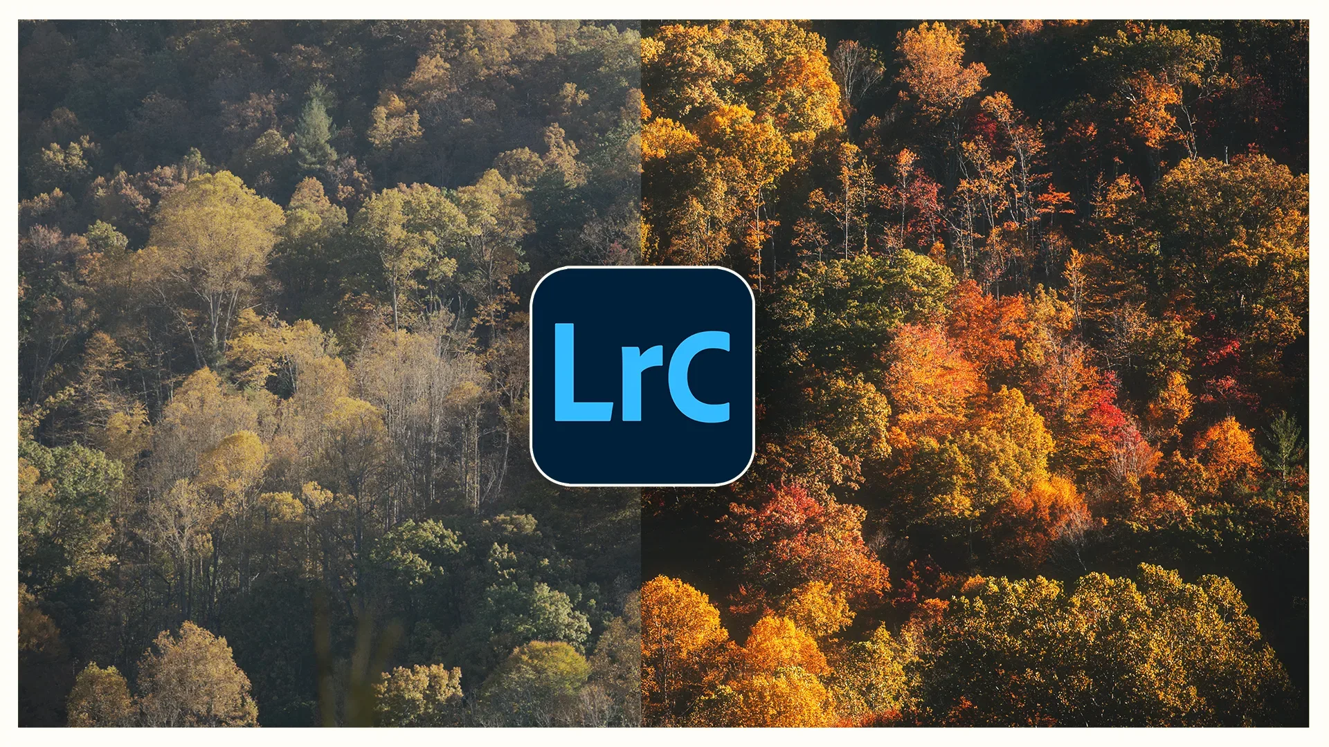
Conclusion: How to Make Your Fall Colors POP in Lightroom
So that is how I make fall colors photographs really pop in Adobe Lightroom. Remember to capture the best image possible in-camera (eg. shooting RAW), and you’ll make your job editing much easier.
If you enjoyed this blog, don’t forget to Subscribe down below for Newsletters featuring new tutorials and product updates!
Until next time, get out and go shoot!
Film Grain Overlay Pack
Bonus: Film Grain Overlays
To add some extra character to my fall colors photos, I showed my method for adding film grain to my shots. After brining my images into Photoshop, I added a layer of film grain, setting the Blend Mode to Overlay or Soft Light. If you’re interested, you can Download my Film Grain Overlay Pack from my shop.