Official Whitehouse Portrait of Trump Released
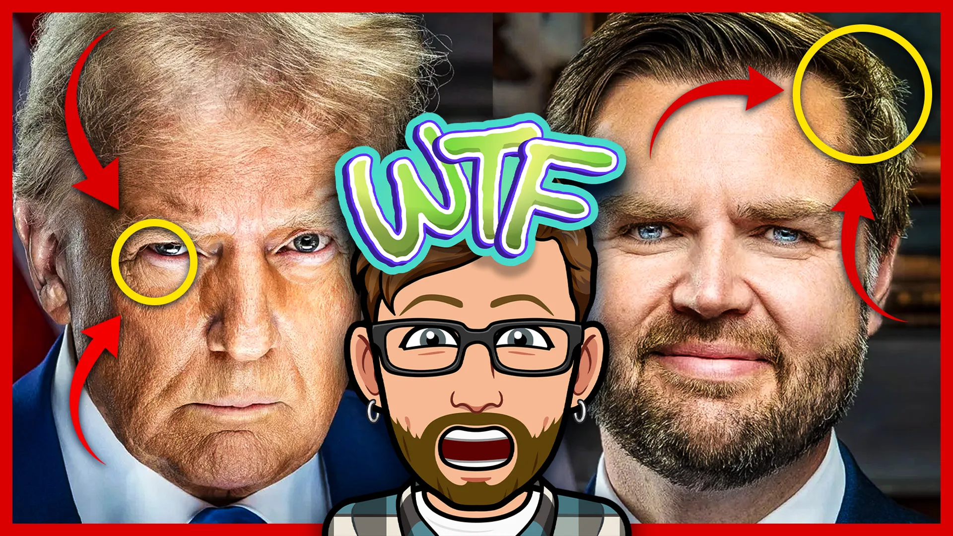
Trump’s official Whitehouse portrait has just been released, and if you think it looks a little odd, you’re not alone! Both Trump and Vance’s official portraits look absolutely awful. No politics here folks, I’m just dropping photography facts.
Now, I don’t like to bash other photographers’ work, however this is a great learning opportunity to show how, or rather how NOT to light a portrait. So, let’s take a closer look at these official Whitehouse portraits of Donald Trump and JD Vance to see what went so terribly wrong during this photoshoot. And don’t get me started on the post-processing…
The History of Official Whitehouse Portraits
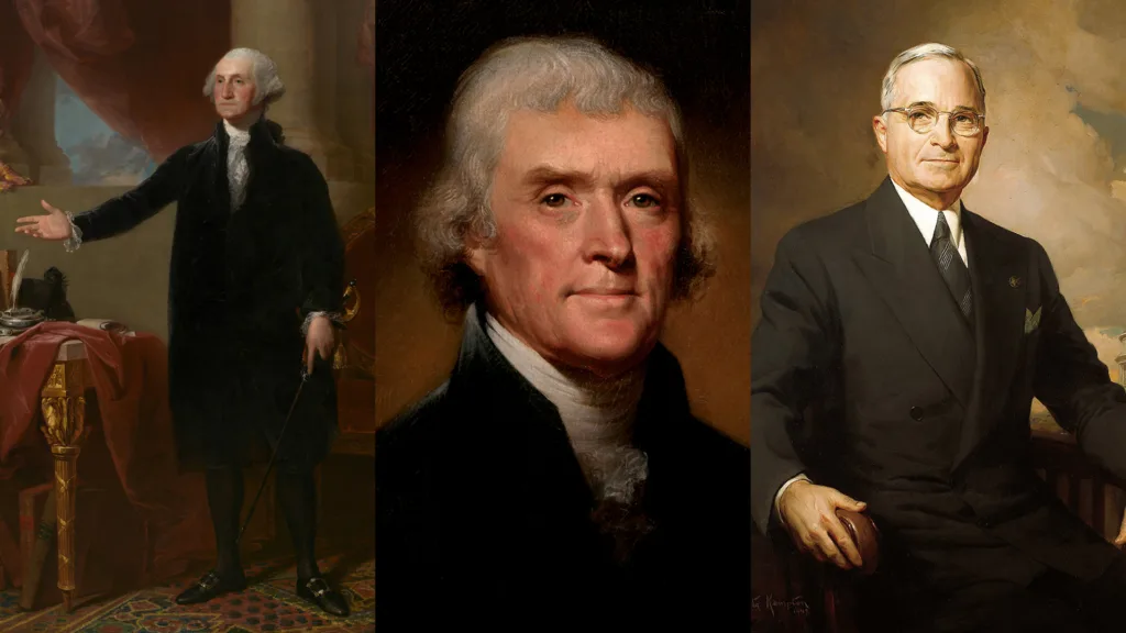
I’ll try my best not to bore you, but I think it’s important to quickly touch on the history and significance of official presidential portraits, long before Donald Trump. The tradition began with the first official portrait painted by Gilbert Stuart of then-President George Washington, in 1796. Presidential portraits are iconic works of art. That’s because the artists chosen to capture the leader of the free world are technical masters of their craft! Or are they?
Okay, I promised this would be short, now let’s get back to photography talk! Did you know the official portrait of former President Barack Obama, back in 2009, was the first to be captured a digital camera? It was captured on one of my favorite DSLRs, the legendary Canon 5D Mark II with a 24-105mm lens.
President Donald J. Trump’s Official Portrait
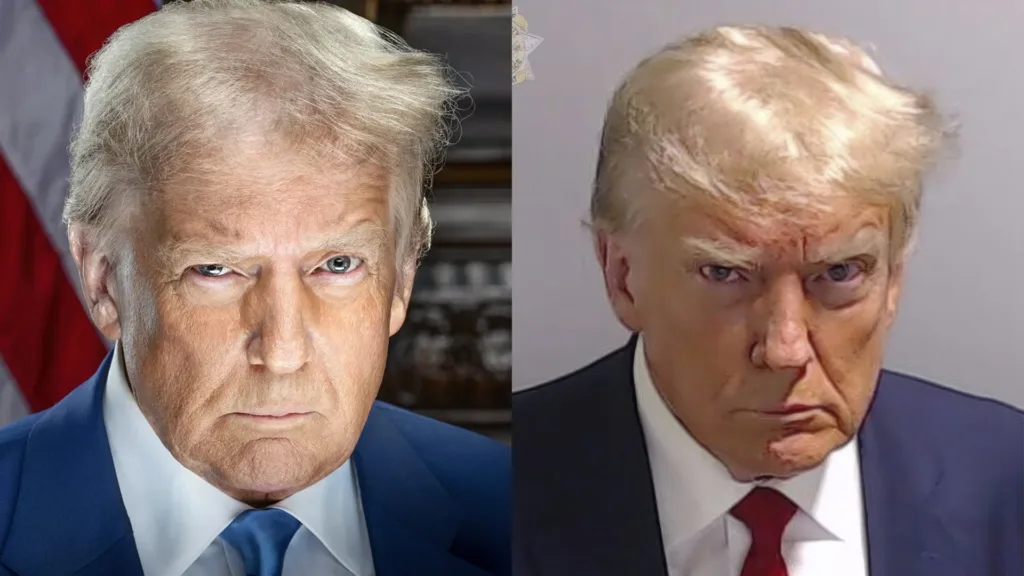
It’s critique time. Hold on to your MAGA hats, because this might get messy (I kid, lighten up!). My first impression when looking at the Trump official Whitehouse portrait, is that the posing looks strangely similar to his mugshot from Fulton County Sheriff. The downward tilt and slight turn of the head are identical. If I had to guess, I’d bet this is 100% intentional for the incoming administration to play off the iconic mugshot. In terms of marketing, it was a creative move that’ll surely generate some free headlines. Again, we’ll be apolitical here, but I don’t love the half-squinting eye either.
It’s All About the Light
Let’s talk portrait lighting! Here’s where I really begin to take issue with both Trump and Vance’s official Whitehouse portraits. Starting with POTUS, let’s breakdown the lighting setup based on what we can see. I see two hair lights behind Trump, one on our left and one upper right. They actually create good separation between the subject and background. However, this is where I think things went wrong…
It would appear that the photographer put the key light down below (aimed up) and a reflector above the head. This is the inverse of a popular portrait setup called Clamshell Lighting. Why is this bad? For starters, putting your key light below eye-level will give your subject the eerie look of being lit by a campfire. Probably not a wise decision for an official presidential portrait…
Furthermore, what I assume to be a picture frame in the background (right) has a quite distracting pattern, even with a fairly shallow depth of field. Lastly, there is a massive gradient mask added to the lower right of the portrait in some attempt to direct the viewer’s eye upward. A big post-processing fail in my book.
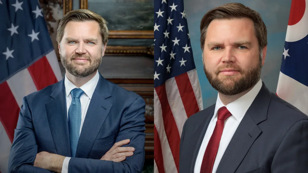
JD Vance Official Portrait Critique
On to our next critique, we’ll take a look at Vice President JD Vance’s official Whitehouse portrait. I think this may be slightly worse, and here’s why. While it appears that the lighting setup from the previous portrait may have stayed the same, Vance’s lighter completion highlight its flaws even more.
Take a look at the eyes. They feel glazed over and and empty, not how you want your Vice President to be portrayed. This is due to the strong fill light from below, and what appears to be some editing done to the eyes. It looks like they were brightened up and taken a touch beyond what looks natural. It feels like his eyes are ready to blast laser beams!
It took me awhile to pin point this next issue, but take a look at Vance’s mouth. When we compare this official photo that a more natural looking previous capture of Vance, the differences are even more obvious. He looks a little too shiny and reflective. Great portraits are a balance of light AND shadow. Shadow gives dimension to the subject. This portrait however, is left feeling overly-lit and just flat.
Finally, I find the background to be more distracting, because unlike Trump’s portrait, the flag and picture frame’s edge are not hidden behind Vance. This portrait is a wider composition than Trump’s, so the depth of field isn’t work to the photographer’s advantage as well here. Now this last note likely isn’t the photographer’s fault, but worth mentioning for other portrait photographers out there. Pay attention to your subject’s hair and clothing. A wrinkled suit and hair “fly-aways” are an easy fix BEFORE you snap the photo.
Trump Official Whitehouse Portrait Critique — Final Thoughts
Regardless of your political stance, I hope you enjoyed my critique on the newest official Whitehouse portraits of Trump and Vance. I think it’s super important to be able to breakdown good and bad photographs to better understand why they look good, or in this case, pretty bad. Understanding Portrait Lighting techniques is critical to portraying your subject in the best possible light — pun intended!
If you liked my breakdown and want to learn more, consider 1-on-1 Photography Coaching to improve your portrait skills. Everyone learns at a different pace, and a personalized coaching session may be just what you need to level up your photography!
Until next time, get out and go shoot!
